From time to time we receive some controversial items in our inbox, and we’d argue that today’s post covers one of these in extraordinary detail.
Anything related to politics is always going to drive opinion and like it not, the infographic we are featuring today does exactly that.
The team at Wristband have produced something that looks at foreign aid in detail that we’ve never really seen before. Or, we have seen it, but it’s never been put together in an easy-to-digest format. So, first and foremost, kudos to their design team or agency who is responsible for this.
If we take a look at the content, it’s here where we really started to take note. Granted, we can’t say that foreign aid was something we were overly familiar with, but after dissecting this infographic all soon became clear.
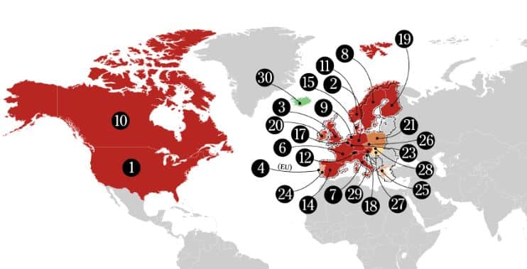
Firstly, the US is by far and away the biggest contributor to foreign aid by quite some margin. How much? If the figures are to be believed, it’s to the tune of around $34 billion per year. It’s massive.
Then again, we are talking about an economic powerhouse, and it’s when you start to drive into the details of the infographic that you start to feel as though it’s perhaps not as much as it potentially could be. If it is looked at purely from a GNI perspective, it’s just 0.18%. From this point of view, they’re not actually as generous as the headline figure makes out.
In fact, if we look at things purely from a GNI perspective, some surprising candidates enter the picture. Sweden is by far and away the leading nation, donating 1.02% of their gross national income. Luxembourg isn’t too far off either, at 1%, while Norway is at 0.99%. Out of all of the so-called larger countries, the UK ranks pretty high, and currently meets their target of 0.70% which equates to $18.10 billion per year.
There are plenty of other interesting stats there and in terms of some of the countries which are being somewhat stringent with their pledges, Slovenia, Slovak Republic and Hungary are all lingering between 0.11% and 0.16%. All in all, there is a lot of data to sum up, and we will instead point you in the direction of the graphic so you can draw your own conclusions: https://www.wristband.com/content/which-countries-provide-receive-most-foreign-aid/